
More finished stuff hot off the paint station - a Paladin, the second Jomsviking Bondi mentioned in my last post and a small Burrows and Badgers scatter terrain piece.
First up is the Paladin, an old early 80’s TSR Dungeons and Dragons Paladin. I named him Rogelio de la Vega (Bonus interwebs points for getting that random reference.) and decided I’d paint him up in colours I don’t normally choose, so it was a fun experiment and I think he came out just fine. I like to think that he is a terrible dandy and an obvious show off, more likely to step in to stop a nefarious act only to bolster his reputation in the eyes of onlookers.
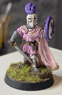 |
| White plate armour? That must mean this guy has some money to spend on enameling! |
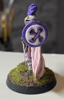 |
| The crossed keys symbol doesn’t feature in my limited DnD searches online. Guessing it’s from the real life Catholic reference? Or not. Either way, it helped key in (see what I did there?) the purple in his colour scheme beyond his feathers. |
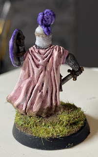 |
| Pale pink cloak and darker pink tunic were both applied in craft paints. Rather surprised with how good their finish looks! |
This next bloke is a metal mini by Gripping Beast, a Jomsviking Bondi for my Dark Ages project. That fancy helmet and green poncho-cloak-thing combo must have been a nice part of a loot pilefrom a raid in the Mediterranean or some such. I kept the paint job on this one simple so he wouldn’t stand out too much from the others in his unit.
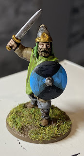 |
| Not sure this feller is all that fearsome like the other Vikings? Don’t tell him I said that though |
 |
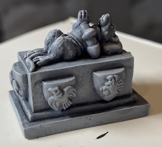
Last up for this post is a little resin piece of scatter terrain. I got it for my church terrain (to be featured in a later post) and it’ll add some fun Burrows and Badgers style design elements to the whole affair. Simple painting to look like the stone mausoleum it’s supposed to represent.
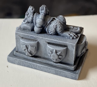 |
| Basic paint job so it looks stone-y. Was going to try for a marble effect but… no, not this time. |
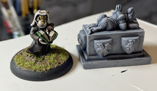 |
| Sister Tomasina looks to the scripture whilst next to the mausoleum of Sir Gorgonzola. Little does she know, his life crumbled about him when pressure was applied. |
There’ll be more soon, tho at a bit of a slower progression.
Dearly hope all are well out there,
- Dai
Oh, what a great looking stuff!
ReplyDeleteLove it!
Glad you do mate! :)
DeleteGood stuff, Dai. I especially like Rogelio de la Vega, and that colour ties in well with the TV character's shirts. ;-)
ReplyDeleteHa! Happy you got the reference! Not a fav show, but goodness I love that character - he's just so ludicrous!
DeleteThanks Simon!
Great work on all Dai, The tomb is a great sculpt, but love the humour you've painted in the other two.
ReplyDeleteAppreciate that Dave. Cheers mate.
DeleteVery nice work and I particularly like the eighties paladin
ReplyDeleteHe's a nice sculpt and was a fun one to paint up. Thanks sir.
DeleteMore interesting and well-painted additions to your project.
ReplyDeleteThanks Jon. Hope to have another post up soon!
DeleteLoving the colour schemes Dai and that sone mausoleum has just brought the biggest smile to my face!
ReplyDeleteThanks Michael! As soon as I saw the mausoleum online, I knew I had to get one, it's just so neat!
DeleteI admit I had to google the Rogelio de la Vega reference and you totally made my day with this post :D
ReplyDeleteSuch daring paintjobs! I also smiled at the mausoleum, didn't see that coming. Absolutely genius!
Ha! Couldn't help myself with that one.
DeleteGlad you like 'em mate.
Lots of great stuff there, but Rogelio is a standout. Just as he would like it!
ReplyDeleteHehe, yes, yes he would!
DeleteRogelio looks very Slaanesh, Dai! LOL! The pink and purple looks really good though and it's nice to see different colours on a knight/paladin. Love the green cloak on the Viking, and the stone effect on the mausoleum is really good too.
ReplyDeleteVery Slaanesh I agree. Like you said it's different for sure, I just wanted to get out of my comfort zone.
DeleteThanks Mat!
Great stuff all around. But watch out!!! Here comes a pedantic attack!! That’s a sarcophagus and not a mausoleum and even then you should of called it a MOUSEleum for extra cool internet points. 😀😀
ReplyDelete(Don’t hate me).
Yeah, sarcophagus is correct, but the website had it listed as a…. Mouseoleum, so you aren’t original Blain! Lol
DeleteGood for you daring some unusual colour choices. The pink turned out quite nicely I think!
ReplyDeleteThe animal sepulchre is pretty amazing. Nice find that.
Thanks Dave!
DeleteExcellent brushwork Dai, I do like the tomb, it looks like its made from stone.
ReplyDeleteThank you Ray!The stone effect was successive layers of drybrushing, glad you liked it mate.
DeleteI like your 80s Paladin, he must be in danger of losing his status with all that self love! Good looking viking and the tomb/mausoleum/sarcophagus whatever,looks ace!
ReplyDeleteBest Iain
He just might do at that!
DeleteThanks again Iain!
It's another beautiful day to be Rogelio!
ReplyDeleteExactly! ^_^
DeleteThanks for dropping by!
Very adventurous with the choice of colours Dai. He will stand out on the battlefield so lets hope he fights as good as he looks.
ReplyDeleteYeah, he might end up all bluster and no bite! Cheers Pat!
Delete